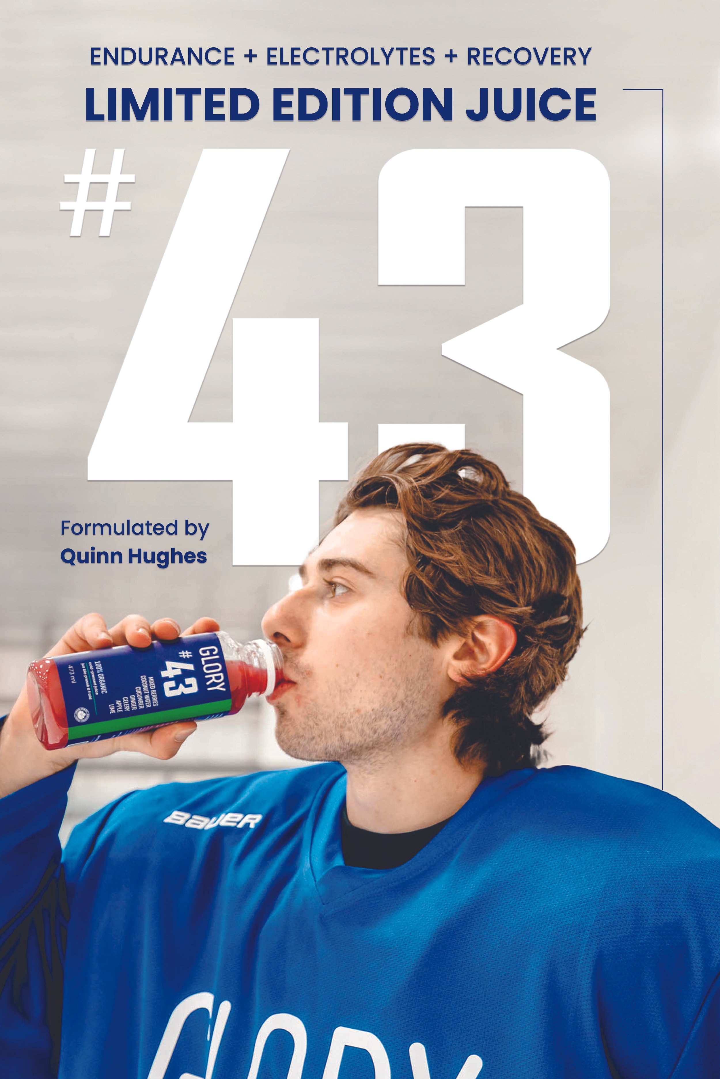
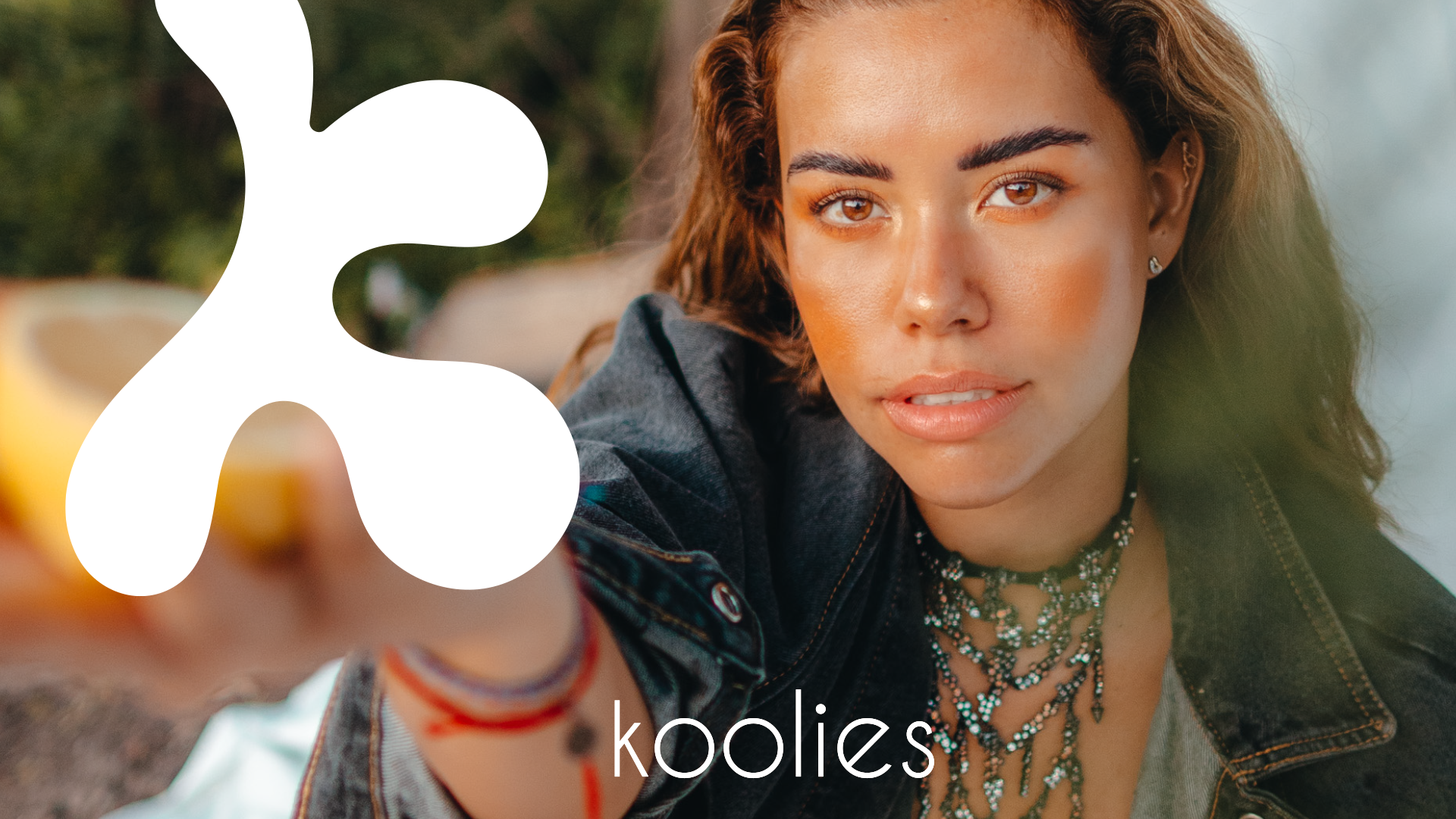
#43 CAMPAIGN
X GLORY

LABEL DESIGN
PHOTOGRAPHY
ADVERTISING CAMPAIGN
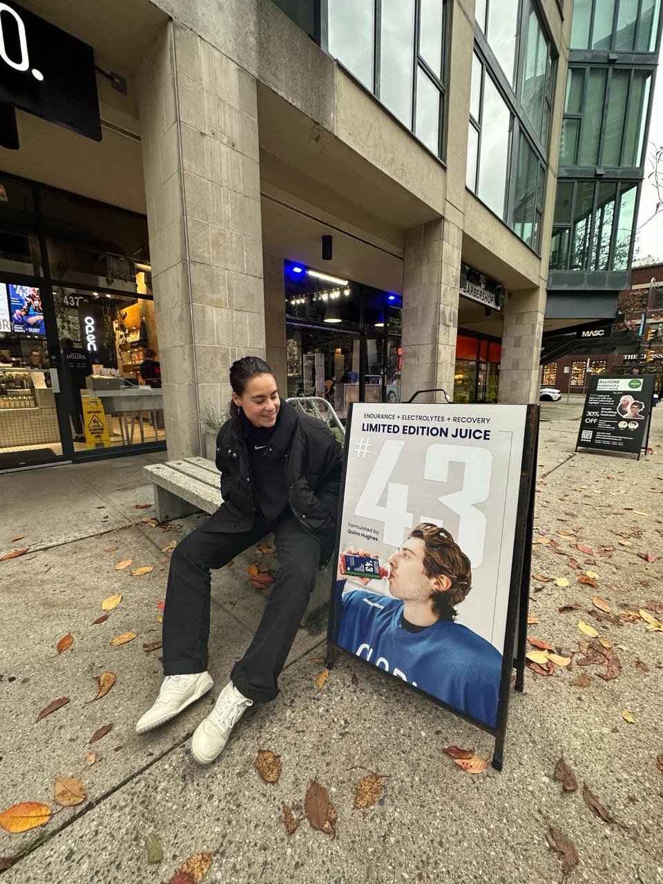
PRINTED ASSETS
DIGITAL ASSETS


THE LABEL
The angle was to make the bottle resemble a Canucks player on the ice, using the team's colours, Hughes' jersey number, and subtle hockey elements, while making sure Glory’s brand identity remained. It's a tribute to his leadership and skill, capturing the essence of his game while enjoying a refreshing beverage.

PLAYER TRADING CARD WITH EVERY ORDER
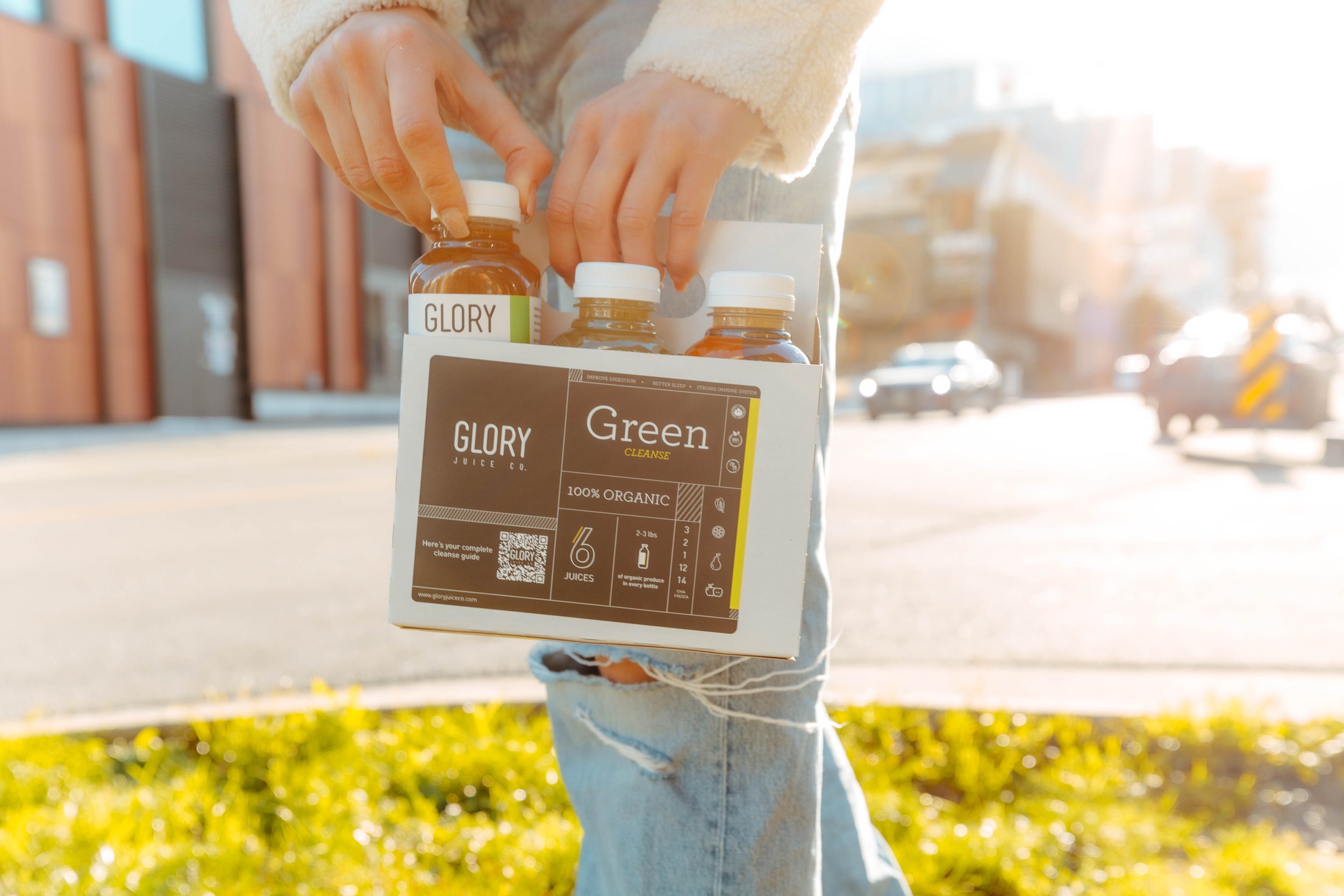
I led the photoshoot for Quinn Hughes' campaign, capturing both on-ice action and locker room moments. These images became the foundation for the campaign's printed assets, including ads, player cards, and flyers. We also used them in digital materials such as website hero images, social media posts, press releases, and web ads. This allowed fans to connect with Hughes as the Canucks' captain on and off the ice, creating a powerful and cohesive campaign.
Store applications and applied label design


The main challenge in the campaign was harmonizing Quinn's identity as the Canucks' hockey captain and his passion for natural nourishment. The solution involved integrating athletic high performance energy with natural freshness visually and narratively. Coherence with the Canucks' brand, promoting accessibility, crafting a dual narrative, and ensuring consistency across channels were key strategies for success. The campaign aimed to celebrate Quinn's athletic role while making natural juice appealing and accessible to a broad audience.
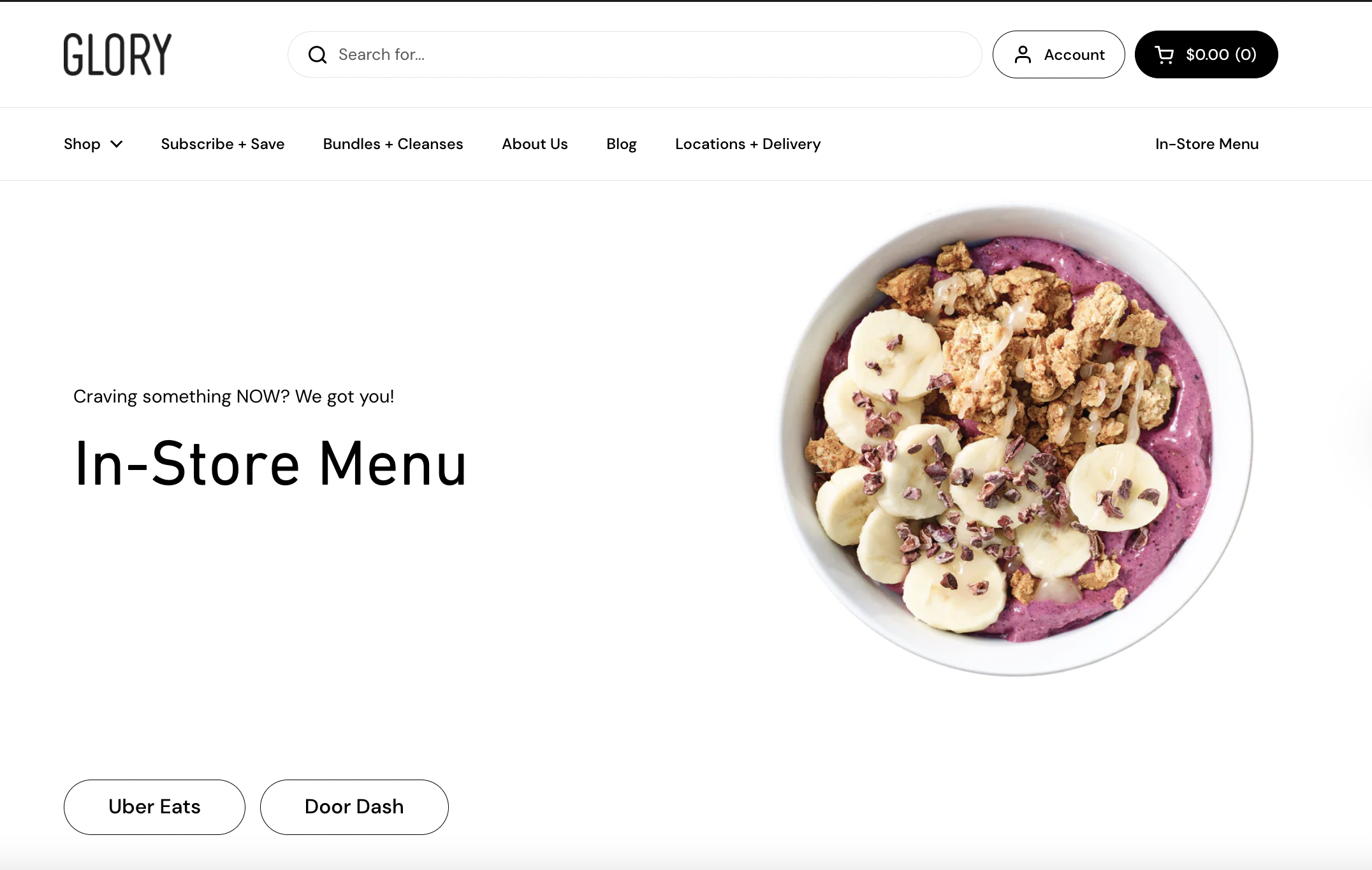
GLORY JUICE CO.
GLORY JUICE CO.

In my role as the lead designer at Glory, I am the driving creative force behind all our printed/ digital media, social media communication, campaigns, and the recent overhaul of our website’s full re-design. However, my responsibilities extend far beyond mere design; they're rooted in storytelling. Through photography + videography, I strive to encapsulate Glory’s organic promise.

WEB DESIGN
GRAPHIC DESIGN
PACKAGING DESIGN
PHOTOGRAPHY
DIGITAL + PRINTED ASSETS
SOCIAL MEDIA DESIGN


Meloon Juice Brand
The task at hand was to craft a juice box with teenage appeal. The brand sought a design that was playful and approachable, with a touch of organic charm. It was crucial for the box to stand out and capture the imagination of the target audience. After much brainstorming…….
The solution: a design featuring a minimalistic splash of negative space, subtly hinting at the flavour within. This approach not only met the brand's requirements but also added a whimsical flair that would surely
catch the eye of any teen.
for ization studio

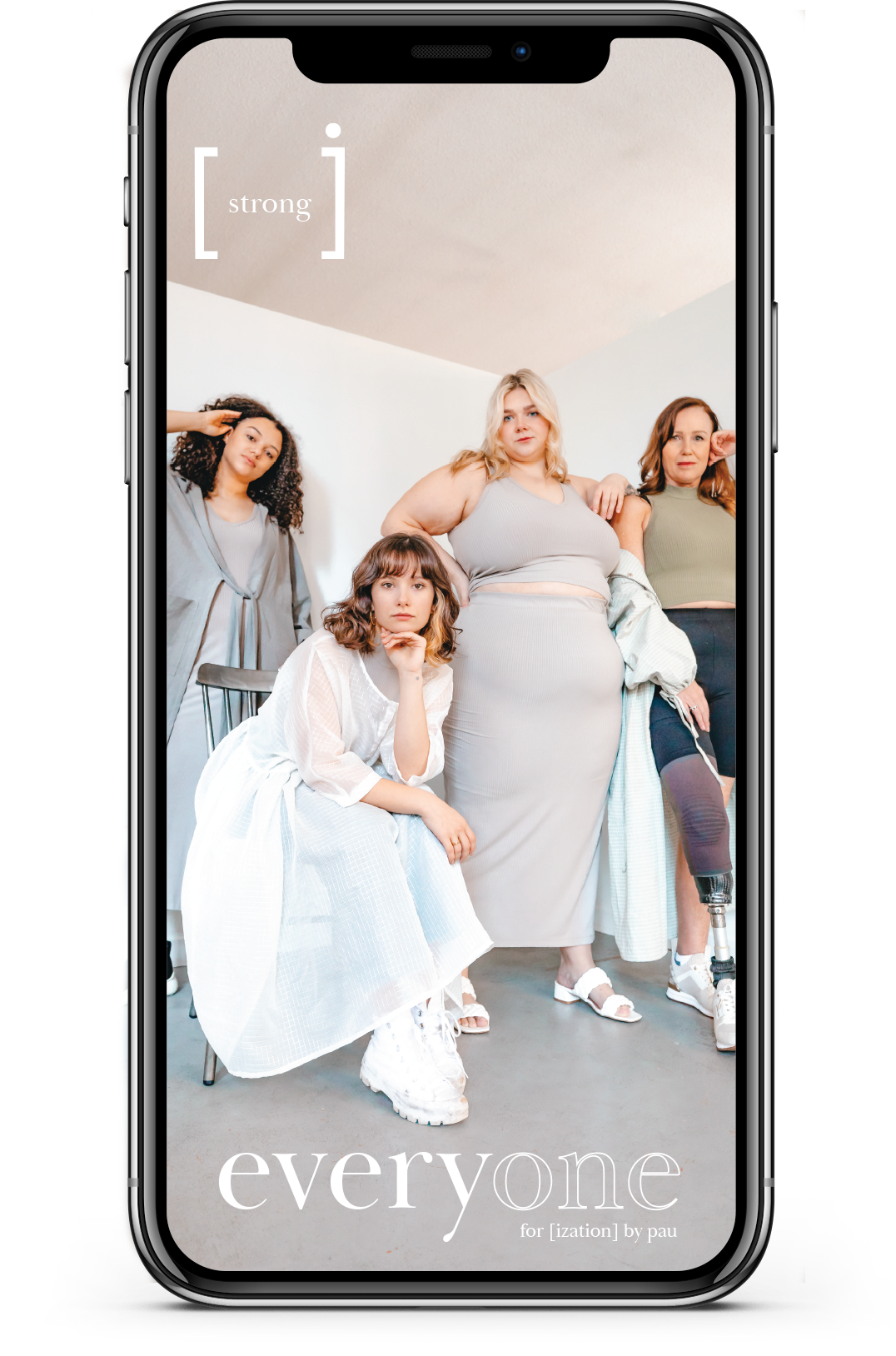
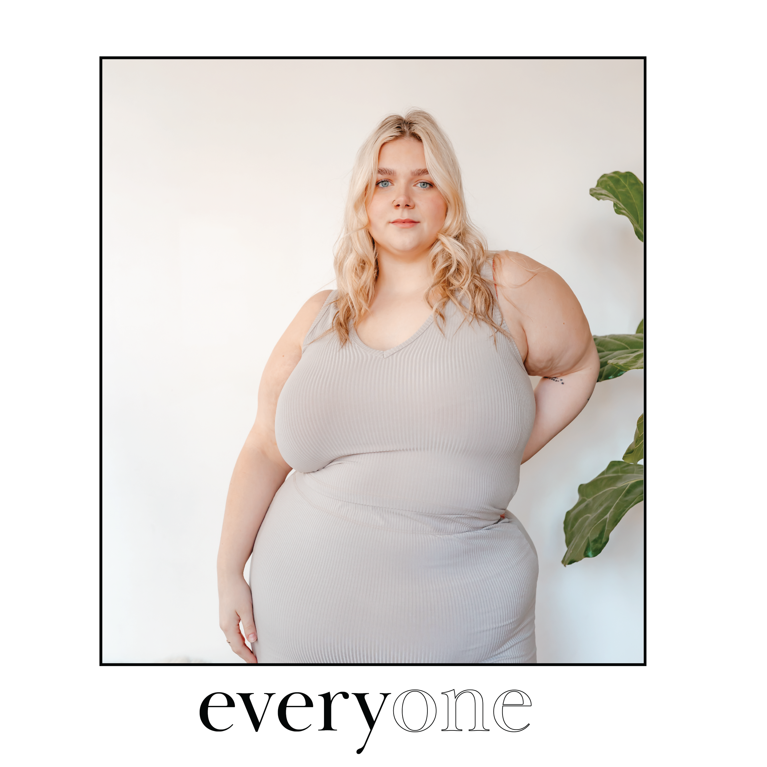
EVERYONECAMPAIGN
Everyone isn't just a campaign; it's a heartfelt celebration of diversity and a loud call for inclusion. In a world where fitting in often feels like the norm, we're all about embracing the freedom to just be ourselves. Hailing from Vancouver, [-ization], is a local brand all about making clothes that fit real people of all shapes and sizes. Our editorial campaign is like a love letter to individuality, proudly showing off the beauty in our differences while also celebrating what brings us together. Assets include: Editorial photography, Social media ads and website digital media, where we're using visuals to spread some good vibes and remind everyone that we're stronger together. These projects mean the world to me because they're my way of making a difference doing what I love most.


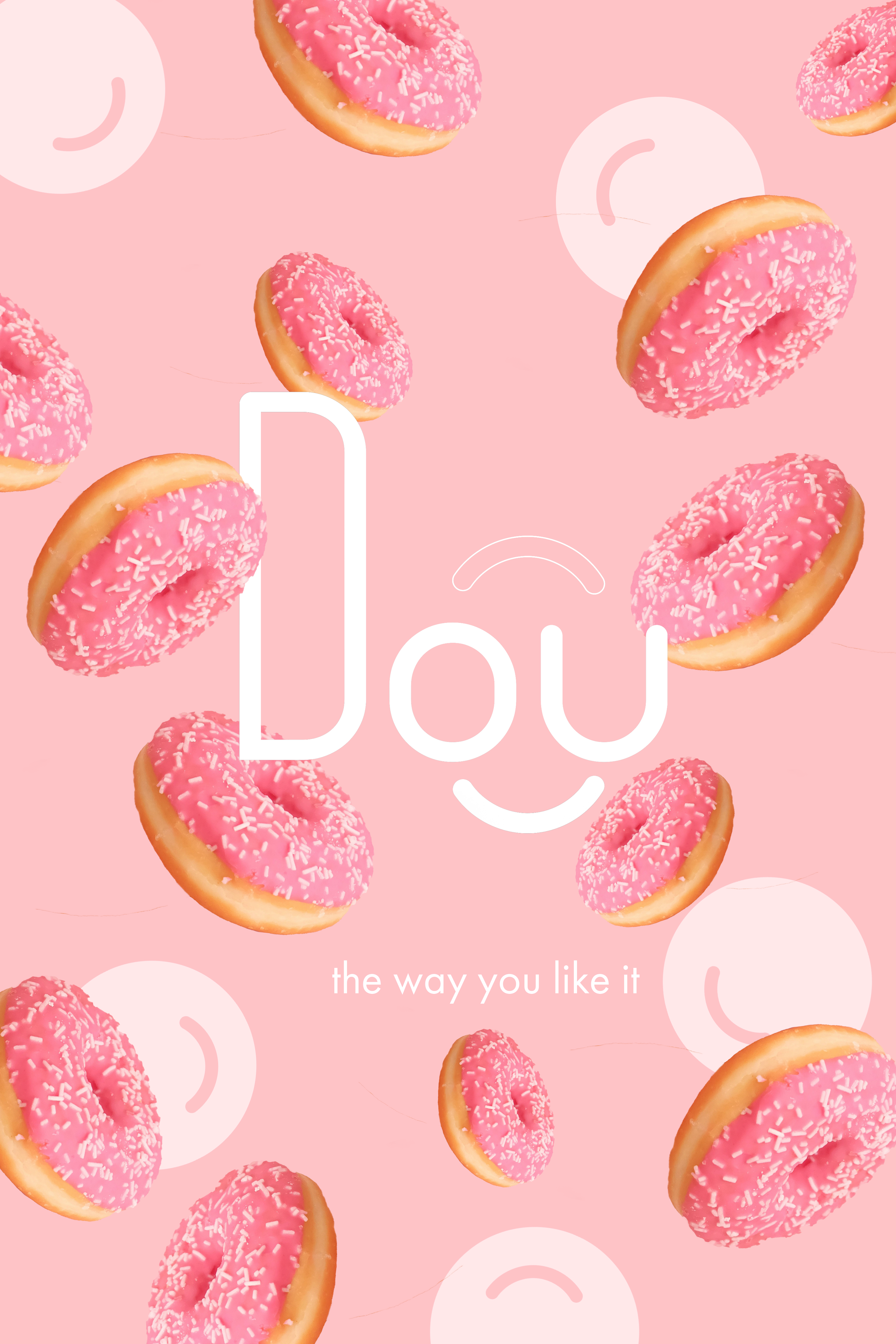
Dou, your neighborhood doughnut haven
The challenge of this project was to establish the brand identity for a high-end, family-friendly doughnut shop, starting from square one (without a provided name).
The solution: Dou! A whimsical and approachable brand that veers away from the traditional "mom and pop" aesthetic, instead opting for an exclusive design and logo that exude charm and sophistication. Throughout the process, we ensured to preserve the vibrant and exciting essence that defines delicious doughnuts!


Short Fashion Film
GOREEA’s 2022 summer collection


Short Fashion Film
URAWESOME collection 2023


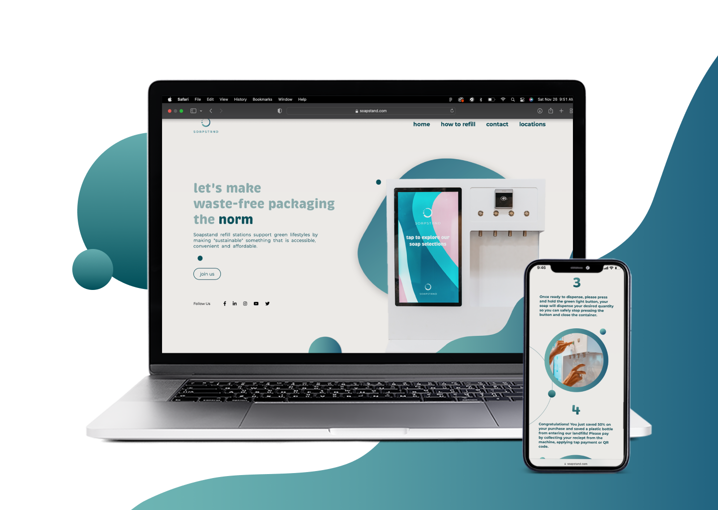
Website design for Soapstand, a zero-waste company based in Vancouver BC. With the goal of making single-use containers the norm. Soapstand ‘s innovative solution for soap refilling needed a new website, which is a primary touch point with their customer’s. The challenge was to create something that was both modern and approachable. The result was a design that is both desirable and intuitive.